Task Completion
The critical path now requires zero extra steps. The receive field updates live, so users get their answer before pressing any button.
How applying core UX principles transformed a cluttered forex tool into a clear, trustworthy, and efficient banking experience.

The NBE Forex Calculator is used by Egyptian bank customers who need to convert between EGP and foreign currencies — for transfers, travel budgets, or financial decisions. The primary goal is speed and confidence: know "how much will I get?" without friction.

A heuristic evaluation of the original screen against Nielsen's 10 Usability Heuristics revealed 3 critical, 4 moderate, and 5 minor issues — all increasing cognitive load and reducing user confidence.

Three CTAs — Calculate, Back, Go to Price-List — at near-identical visual weight. "Back" is tertiary but only differs by gray fill.

Sits between Amount and Buy Currency with no visual relationship to what it swaps. Should be an icon button between the two currency selectors.
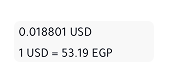
0.018801 USD and 1 USD = 53.19 EGP are plain body text with no label, container, or hierarchy. Users can't parse which is the live rate vs. the inverse.
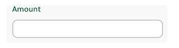
Empty box with no currency symbol or hint. Users don't know if they type or wait for auto-fill.
 ️
️The Banknote/Transfer toggle should be a segmented pill control — the correct mobile pattern for mutually exclusive binary options.
SWAP, CALCULATE, BACK — all-caps reduces readability. Sentence case is the modern iOS convention.

A completely different context competing with the primary CTA. Should be a secondary link, not in the action stack.

Card, dropdowns, buttons all have slightly different radii. Needs a unified radius token.

No label prefix — reads as a stray debug string rather than a helpful unit indicator.

No disabled state on Calculate before amount is entered, no error handling implied.
Inconsistent spacing gap between SWAP and Buy Currency vs. the tighter spacing elsewhere.

The green header is partially clipped by the screen edge — looks unintentional, not a deliberate design choice.
Every design decision in the redesign was anchored to a named UX principle. Here are the six principles that drove the most significant changes.
The original action stack had three CTAs at near-identical visual weight. "Back" is a navigation escape. "Go to Price-List" is a completely different context. Both competed against the single task the user came to do.
The original radio buttons were approximately 16×16px — less than 40% of the 44px iOS minimum. A user with average thumbs had a meaningful error rate on every toggle interaction, before the core task even started.
The SWAP button sat between unrelated elements. The rate values floated as uncontained plain text with no labels or hierarchy. Users couldn't parse which number was forward vs. inverse.
Four minor problems shared one root cause: all-caps labels creating visual noise; inconsistent radii; the orphaned "1 EGP" string; and the clipped green header. None contributed to the task.
The empty amount field left users uncertain. "Sell Currency / Buy Currency" uses banking back-office terminology. At a currency desk, people say "I want to send £200" — not "sell GBP."
The original provided a result but showed no feedback state when the field was empty — the Calculate button looked identical whether blank or populated. No disabled state, no input validation, no error handling.
type="text" inputmode="decimal" with a numericOnly() validator that strips non-numeric characters instantly. The receive field updates live on every keystroke.Each step in the design process started with a structural wireframe — establishing layout, hierarchy, and logic — before being refined into the final high-fidelity UI. Right side shows the wireframe reasoning, left side shows the delivered design.
The original radio buttons were 16×16px — too small for reliable tapping and semantically mismatched to mobile conventions. A segmented pill control is the standard iOS pattern for mutually exclusive binary choices.
The wireframe established the full-width layout and the filled/ghost active state logic. In high-fidelity, the active tab received the brand green gradient — visually linking it to the primary Calculate CTA below, creating a consistent colour language for "primary action."
rgb(82,209,124) → rgb(34,145,139) at 166° + rgba(0,0,0,.2) overlay. Height: 47px. Border-radius: 32px. Both states shown above.The original design showed two raw numbers floating in the screen with no container, no labels, and no visual relationship to each other. Users couldn't tell which was the forward rate and which was the inverse.
The wireframe established the two-cell card with a vertical divider — making the two values spatially distinct but visually grouped. Direction labels ("EGP → USD") were added directly above each value. In high-fidelity, the labels use a muted green #92a699 and values use monospace type for numerical clarity.
#92a699 · 11px. Rate value: #1a1a1a · 17–20px. Container: border-radius: 32px. Divider: 3px solid #f5f5f5. Both states show dynamic label updating.The wireframe established the most critical layout decision: placing the swap button on the horizontal dividing line between the "You send" and "They receive" rows. This is the only position where it is spatially adjacent to both elements it acts on.
The currency pill (flag + code + chevron) was designed in wireframe as a compact interactive affordance — small enough to not compete with the amount values, large enough to tap confidently. In high-fidelity, the green brand gradient was applied to the swap button to match the primary action family.
40×40px circle · brand gradient · custom exchange.svg with drop shadow filter. Currency pill: border: 0.5px solid #d6e4db · border-radius: 8px.The original screen had three buttons at near-identical visual weight — CALCULATE, BACK, and GO TO PRICE-LIST — all competing for attention simultaneously. This violated Hick's Law: the more options at equal weight, the longer the decision time.
The wireframe established a strict 3-tier hierarchy before any colour was applied: filled (primary), outlined (secondary), text-only (tertiary). In high-fidelity, the gradient was applied only to the primary action — Calculate — making it the only element that fights for attention. Clear recedes to an outline, and the price list becomes a quiet text link.
52px · border-radius: 16px. Secondary border: 2px solid #d6e4db. Tertiary: no border, no background — gradient icon only.| Element | Change Made | Principle | Rationale |
|---|---|---|---|
| Rate type selector | Radio buttons → Segmented pill | Hick's Law Fitts's Law | Reduces friction; meets 44px iOS minimum tap target |
| Rate display | Floating text → Labelled two-cell card | Gestalt Proximity | Groups related data; users immediately know what each value means |
| Rate labels | Static → Dynamic from selected pair | Nielsen #1 — Status | System always reflects current state; labels match user's selection |
| Amount input | Empty → "0" placeholder + prefix | Nielsen #2 — Real World | Removes ambiguity; users know exactly what to type and in what unit |
| Field labels | "Sell/Buy Currency" → "You send / They receive" | Nielsen #2 — Real World | Conversational language matches how users think about transfers |
| SWAP control | Full-width button → Circular icon on divider | Gestalt Proximity Fitts's Law | Positioned between the two fields it affects; spatially communicates function |
| Currency selectors | Text dropdowns → Flag + code + chevron pill | Nielsen #2 — Real World | Flags are the universal real-world currency signal; chevron signals affordance |
| CTA hierarchy | 3 equal buttons → Primary + Ghost + Link | Hick's Law | Single dominant action eliminates decision paralysis |
| Button labels | ALL-CAPS → Sentence case | Nielsen #8 — Aesthetic | Matches iOS conventions; improves readability and modernity |
| Input validation | type="number" → text + numericOnly() | Nielsen #1 — Status | Prevents bad input instantly; removes spinners; triggers numeric keyboard |
| Container structure | Flat stacked → Tab card + overlapping calc card | Gestalt Proximity | Visual depth communicates hierarchy without adding elements |
While this is a design exercise rather than a live A/B test, the improvements can be projected against established UX benchmarks and mobile interaction research.
”Good design, when it's done well, becomes invisible. It's only when it's done poorly that we notice it.
Jared SpoolUX researcher & author
The critical path now requires zero extra steps. The receive field updates live, so users get their answer before pressing any button.
Applying Gestalt principles and Hick’s Law, 9 independent elements were consolidated into 3 grouped sections. Users process less at once.
“You send / They receive” aligns with how users describe transfers in conversation, reducing the need for mental translation.
Every control now conforms to iOS HIG — segmented controls, minimum tap areas, numeric keyboard, bottom-anchored primary actions.
Every friction point had a root cause in a violated UX principle. None were arbitrary — they were predictable consequences of ignoring established knowledge about how humans perceive and interact with digital interfaces.
The fully functional redesigned Forex Calculator — built from the Figma design spec with all UX improvements applied. Select currencies, enter an amount, and see live conversion.
↑ Fully interactive — tap tabs, select currencies, enter amounts to see live conversion
Note: The conversion rates shown in this prototype are static values based on the rates at the time of design. They do not reflect live market data. In a production implementation, rates would be fetched in real time from NBE's forex API.